The Double Dividend of Safety Project will work to understand how improving people’s safety can also lead to positive individual health behaviour changes. We will work with organisations to raise awareness of this concept and to help them apply it in their work. Using data from the Lloyd’s Register Foundation World Risk Poll we plan to develop a data dashboard to help organisations estimate the impact that improving different types of safety could have on numerous health behaviours. To make this happen, we’ll also collect validation data in countries representing each of the inhabited continents. These data will not only make it possible to do the statistical modelling that will underly the data dashboard, but they will also enable analyses which will generate new insights into the relationships between risk exposure and health behaviour. Further updates to come!
What might your perceived risk of death by transport accident have to do with your motivation to eat healthily? Well, potentially, the two are causally linked. Indeed, our motivation to look after our health may well be affected by the overall level of risk we face, and that’s something I’ve spent a great deal of time thinking about over the past decade or so. The link could have big implications for how we think about health behaviour. However, my work on this (in collaboration with my excellent colleagues) has only really been published in academic journals, where powerful ideas can be obscured by the necessary details and caveats that must be made in scientific reports. Time to attempt a non-academic explanation!
A popular model in the health behaviour change world is the COM-B model. COM-B stands for Capability, Opportunity, Motivation – Behaviour. As you might expect, the framework suggests that behaviour will be affected by the other three factors of capability, opportunity, and motivation. What I’m about to explain is something which I believe to be one of the “hidden” forces affecting people’s motivation to look after their health. To some extent, it is hidden in plain sight because, once I explain this idea to people, they tend to agree that it’s kind-of obvious. And yet, I believe it is the reason that many efforts to change health behaviour fail, or even widen inequalities*.
*Also see here for an excellent explanation of the important role of agency in the success of population interventions. This is a related, but subtly different, reason that some well-intentioned interventions have turned out to be inequitable.
Perceived uncontrollable risks and health behaviour
So, what is this “hidden” force affecting our motivation to look after our health? Put simply, it’s the extent to which we expect our efforts to pay off in the long run. We all face a variety of health and safety risks on a daily basis. Yet, for some, these risks are more numerous, more serious, or harder to avoid. Imagine, for example, living in a rented apartment that you know to be unsafe. The flammable cladding hasn’t been replaced, and the boiler is broken more often than it works. You suspect it’s probably leaking. Your building is in a polluted neighbourhood, where road accidents are common. Crime and interpersonal violence are rife in this area, so you don’t feel safe, but you can’t afford to live anywhere else. People in your neighbourhood regularly die young. In a context like this, do you think you would worry about eating 5 portions of fruit and vegetables a day? Would you worry about whether you’d got your daily step count in? Not so much, I expect. You would have bigger worries and, even if you had the best possible diet and exercise routine, you won’t necessarily live to see the benefits. This is the basis of the Uncontrollable Mortality Risk hypothesis, which was drawn from a behavioural ecological model by Daniel Nettle. Daniel’s work explains that people of lower social class tend to be more exposed to a variety of health risks, which they generally find harder to avoid. In response to this, his model suggests, they will tend to reduce their levels of preventative health behaviour. The compound effect of this is a widening of the gap: initial health inequalities affect health behaviour, leading to increased inequalities. The idea doesn’t just help us to understand class inequalities. It can help us to understand variation in health behaviour more generally. Anyone who feels that they face unavoidable risks to their health and safety, regardless of social class, should be less motivated to take care of their health. This has some interesting implications for future research. For example, it means we should expect differences in health behaviours based on levels of risk in different environments. This indicates that certain research approaches, such as geospatial analyses mapping environmental risks onto health behaviours could be fruitful. Indeed, the hazards I described in the example above, were imagined in a UK context, and the UK is, in global terms, a relatively safe place. In other countries, challenges such as war, terrorism, violence, extremes of temperatures, and natural disaster risk likely outstrip most other health and survival concerns.
The double dividend of safety
There are many interesting implications of the idea I’ve described so far, some of which are discussed in our academic publications on the subject (see below). However, I want to emphasize one key concept: The double dividend of safety. The double dividend of safety is simply the idea that, if we make people safer, by reducing those risks which they can’t avoid for themselves, we can expect a spontaneous improvement in their motivation to take care of their own health. So, we get the primary benefit of the initial improvement in safety, and the additional, secondary benefit of improved health behaviour.
Understanding the double dividend of safety is important for numerous reasons. Among them, is the fact that public health goals are often approached in silos. Behaviour-change programmes operate in isolation, with practitioners rarely able to address the wider problems affecting those whom they seek to serve. This is not news, of course. Healthcare leaders have pointed out the need to break down this siloed approach. However, the double dividend of safety gives us another reason to call for joined-up thinking. It also emphasises the need to get the basics right. Addressing key challenges such as housing quality, crime, traffic safety and pollution, may turn out to be far more beneficial than a dozen behaviour change campaigns when it comes to reducing health inequalities.
For those who want to see the academic papers:
Pepper, G.V. & Nettle, D. (2014) Perceived extrinsic mortality risk and health behaviour: Testing a behavioural ecological model. Human Nature 25(3) [Article]
Pepper, G.V. & Nettle, D. (2014). Socioeconomic disparities in health behaviour: An evolutionary perspective. In D. W. Lawson & M. Gibson (Eds.), Applied Evolutionary Anthropology: Darwinian Approaches to Contemporary World Issues. Springer. [View]
Pepper, G.V. & Nettle, D. (2014) Out of control mortality matters: the effect of perceived extrinsic mortality risk on a health-related decision. PeerJ 2:e459 [PDF]
Pepper, G.V. & Nettle, D. (2017) The Behavioural Constellation of Deprivation: Causes and consequences. Behavioral and Brain Sciences, 40 (e346)[Link]
Pepper, G.V. & Nettle, D. (2017) Strengths, altered investment, risk management, and other elaborations on the behavioural constellation of deprivation. Behavioral and Brain Sciences, 40 (e346) [Link]
Brown, R.D., Coventry, L., & Pepper, G.V. (2021). COVID-19: the relationship between perceptions of risk and behaviours during lockdown. Journal of Public Health. [Link]
Brown, R.D., Sillence E., & G.V. Pepper (2022) A qualitative study of perceptions of control over potential causes of death and the sources of information that inform perceptions of risk. Health psychology and behavioral medicine 10 (1), 632-654. [Link]
Brown, R.D., Sillence, E., & Pepper, G.V. (2023). Perceptions of control over different causes of death and the accuracy of risk estimations. Journal of Public Health. [Link]
Brown, R.D., Sillence, E., & Pepper, G.V. (2023). Individual Characteristics Associated with Perceptions of Control Over Mortality Risk and Determinants of Health Effort. Risk Analysis. [Link]
Brown, R.D., Sillence, E., & Pepper, G.V. (2023). Perceptions of control over different causes of death and the accuracy of risk estimations. Journal of Public Health. [Link]
Click here for a short guide to measuring perceived uncontrollability mortality risk, and here for an explainer video by Richard Brown.
Things always seem to be evolving at Northumbria University, and one of the latest interesting developments has been the Urban Futures Interdisciplinary Research Theme (Urban Futures IDRT). The endeavour promises to leverage the wide range of methodological and subject expertise across the University in order to “improve quality of life and sustainability in urban areas, taking a human-centred approach“. They summarise the approach as “People, Place, and Planet”.
The Urban Futures IDRT aims to tackle the key challenges of as safety and security, democracy and governance, resilience and sustainability, health and wellbeing, and mobility and transport, using a variety of methodological tools and approaches. These approaches will include, though presumably not be limited to, data and digital technologies, policy-making, co-production, and design. As a behavioural scientist, and a member of the new IDRT, I sincerely hope that we can add some experimental psychology approaches to the mix. Indeed, I’m hoping to encourage IDRT members to apply some of the interdisciplinary style that Daniel Nettle displayed in his the Tyneside Neighbourhoods Study.
Given the scale of the challenges identified, and the great potential for impact, I look forward to seeing what the IDRT can deliver… Watch this space!
Here, you can read Richard’s interview with me for The Psychologist. We chat about the research I’ve been doing for the past decade or so – research which Richard is now moving forward as part of his PhD.
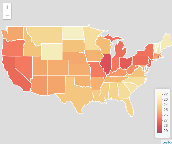
As part of a current project with Calvin Isch and Richard Brown, I’ve been looking at the Global Burden of Disease project’s Summary Exposure Values (SEVs). The SEV is a really useful measure for us, because we’re interested in the extent to which people’s perceptions of risk are associated with objective measures of exposure to health risks. Luckily, the Global Burden of Disease project have done some incredibly detailed work to try to quantify exposures to certain risks.
The GBD describe the SEV as follows:
“A measure of a population’s exposure to a risk factor that takes into account the extent of exposure by risk level and the severity of that risk’s contribution to disease burden. SEV takes the value zero when no excess risk for a population exists and the value one when the population is at the highest level of risk; we report SEV on a scale from 0% to 100% to emphasize that it is risk-weighted prevalence.”
I would recommend this excellent Lancet paper for more details on the construction of this measure.
Since I’m particularly interested in perceptions about uncontrollable mortality risks (risk exposures which are not impacted by individual behaviour), I’ve been using the SEV values for environmental and occupational risks, which is a combined index of those risks not classified by the GBD project as being related to behaviour (see https://ghdx.healthdata.org/ for more on the data).
This all seemed like an excellent excuse to make a new map, this time using Leaflet, an excellent R package, which allows you to create and customise interactive web maps without knowing any JavaScript. Here’s the resulting map. To see the interactive version, please click on the image link and view the map in RPubs, as WordPress won’t allow me to embed it using an iframe.
A map of the Global Burden of Disease (GBD) Project’s summary exposure values (SEV) by state for the USA in 2019.
The RcPsych EPSIG aims to raise awareness of the value of evolutionary theory to psychiatry, as well as encouraging research on the topic. The group has a fascinating mix of members with a range of expertise, bringing together clinical and academic expertise, across disciplines. They hold talks and host symposia, some of which can be found on their YouTube channel. Their newsletters are also available to all, if you want to read more.
People – especially students – get in touch with me on a surprisingly regular basis to ask for the data and shape files I used in my previous post on mapping methods of travel to work in Newcastle upon Tyne.
Unfortunately, since Google discontinued their support for Fusion Tables, people are now unable to download the data and shape files from the maps I created. Never fear! You can find them here.
**This link will take you Dropbox, but you don’t need an account to download the file
Getting other Census and geographies data:
What’s even better than being able to simply download the data from this page? Probably, it’s knowing where to get your own data (especially since the 2011 Census data are about to become outdated). There are couple of really handy websites for accessing Census data and information on UK geographies:
The Nomis website provides a useful portal for accessing census data.
The ONS Open Geography Portal provides a lot of helpful products, including shape files for various geographies.
Hopefully these resources will help you to get your projects done. Happy mapping!
A map from the original project, showing the percentage of residents in each LSOA travelling to work by bicycle (in shades of green), with all data represented in the pop-out bubbles in the interactive version.
I’m beginning to build a bank of resources to support people to use the measures of perceived control over mortality risk that Daniel Nettle and I developed some years ago (Pepper & Nettle, 2014). So far, these measures seem to be a good predictor of health behaviour and, in our data, they outperform the Multidemsional Health Locus of Control (MHLC), which is a commonly used measure examining a similar construct (Brown & Pepper, 2023).
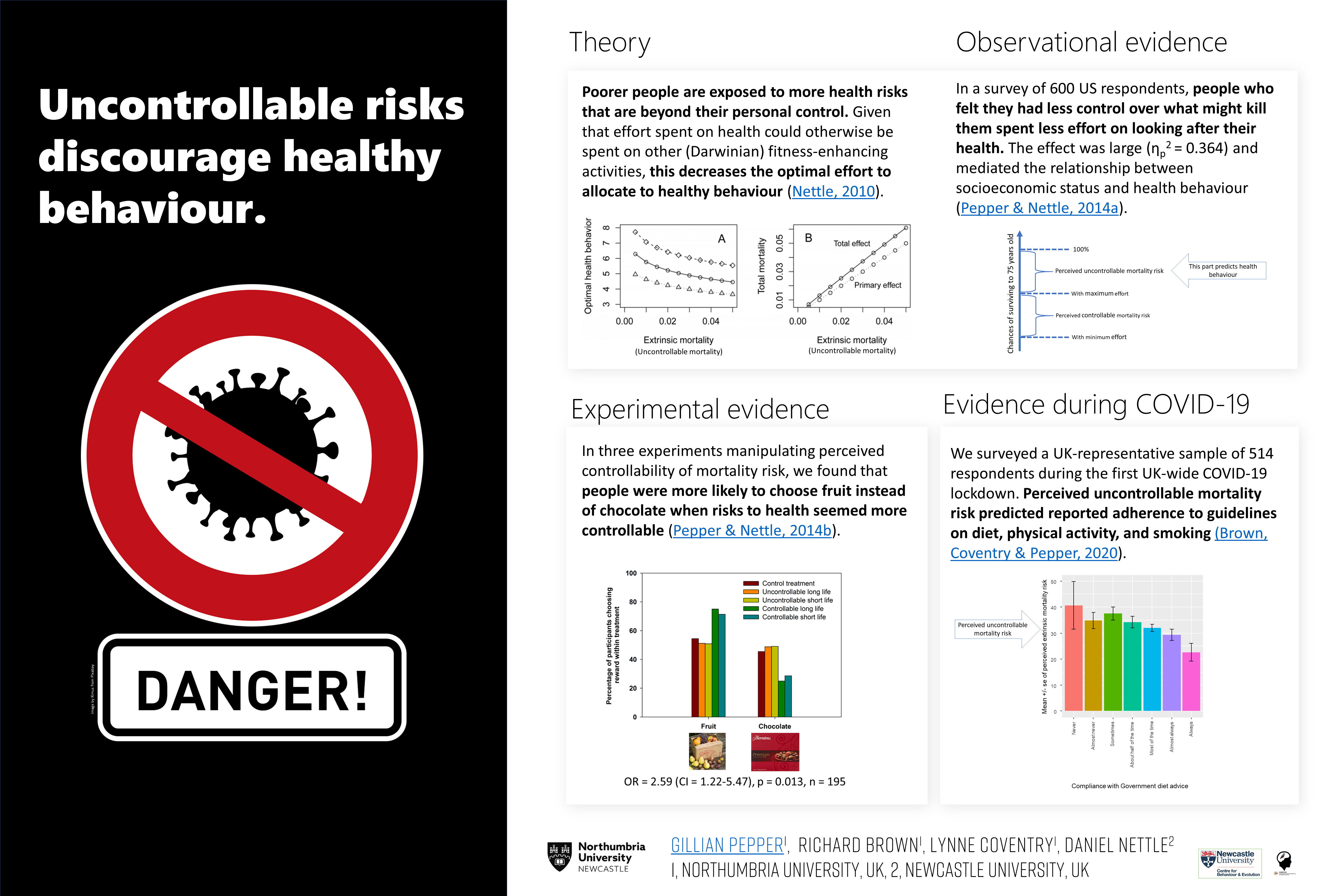
To get things started, I’ve created my first ever #BetterPoster (see here for more on the “Better Poster” concept), giving a brief overview of the theory and evidence regarding the relationship between perceived uncontrollable mortality risk and health behaviour. I presented this poster at EHBEA2021, and Richard Brown gave a talk on some of the evidence summarised in panel 4 of the poster below. The 2-minute audio recording that accompanies the poster can be downloaded here.
I’ve also created a 1-page guide to using the measure, which gives the question text and an at-a-glance summary of what the responses represent, with references for further details. You can download the guide here.
My #BetterPoster for EHBEA 2021 – a summary of the evidence so far on perceived uncontrollable mortality risk & health behaviour.
The poster above is embedded as an image, so the links don’t work. Here are the links to the key references:
The wonderful Richard Brown has created a video, explaining the findings of our paper in the Journal of Public Health. Richard’s creation won him the best talk prize at the Northumbria University Early Career Researchers’ conference, 2021.
Although I understand that many people are suffering from “Zoom fatigue”, an online conference offers a number of fresh advantages. It becomes easier for people from all over the world to participate without time, cost, or carbon footprint concerns becoming barriers. We can be innovative about our scheduling too. Having some pre-recorded talks and posters available in advance of the conference will mean more time to interact with each other on the day. More interaction can mean more ideas, more fun, and more potential for collaboration. Another advantage of having some pre-recorded talks: you can pause, rewind, and watch again! No more wondering if you’re asking a silly question because you didn’t quite hear something that was said earlier on in the talk. Equally, if the topic of the talk isn’t quite as you expected, you can stop watching without fear of disrupting others in the audience. This year’s meeting will enjoy all these advantages, plus some of the buzz of a live event with some live talks and Q&A sessions.
To really boost the interactivity of the conference, we’ll also be running our first ever Evolutionary Medicine and Public Health Grand Challenges! Conference delegates can sign up to work in virtual teams to address the big questions and challenges facing medicine and public health today, with topics ranging from ageing to tuberculosis. The aim of these events is to encourage new connections and collaborations, and to spark innovation in the EMPH community. Check out the ISEMPH-2021 website for further details: https://isemph.org/Grand-Challenges-2021
Delegates at the Inaugural ISEMPH meeting in 2015, in Tempe, Arizona
A little while ago, I was contacted by someone who was looking for a shape file for the Newcastle upon Tyne area, as they wanted to map some data as part of a research project.
It occurred to me that other people might be looking for such a file since, back when I made my maps of transport usage in Newcastle (see previous blog), I’d had to source an ONS shape file of all the LSOAs in England and then manually edit it down to only those contained within the Newcastle area. Should you wish to avoid doing all that work yourself, here is the file!
It is a KML file showing the Lower Level Super Output Areas (LSOAs) in Newcastle Upon Tyne (2011 boundaries). Click here to download.
Example map, based on the KML file provided above, showing percentage of people walking to work by LSOA.