In one of my previous posts, I presented some interactive maps, made using Google Fusion Tables, to support a paper on Cross-country relationships between life expectancy, intertemporal choice and age at first birth, written with my collaborator, Adam Bulley. However, Google have since decided to discontinue Fusion Tables, so I’ve made new maps using Google Data Studio (which I recommend to anyone who wants to quickly and easily generate good-looking data maps from a simple CSV file).
Our paper on Cross-country relationships between life expectancy, intertemporal choice and age at first birth used data from the International Test of Risk Attitudes (INTRA) survey, by Wang, Rieger & Hens (2015), which measured intertemporal choice in 53 countries. We explored the cross-country relationships between average life expectancy, intertemporal choice, and women’s age at first birth across the 46 countries for which full data were available. We found that, across countries, lower life expectancy is associated with a smaller percentage of people willing to wait for a larger delayed reward, and a younger average age at first birth: a result that mirrors findings from studies at the individual level.
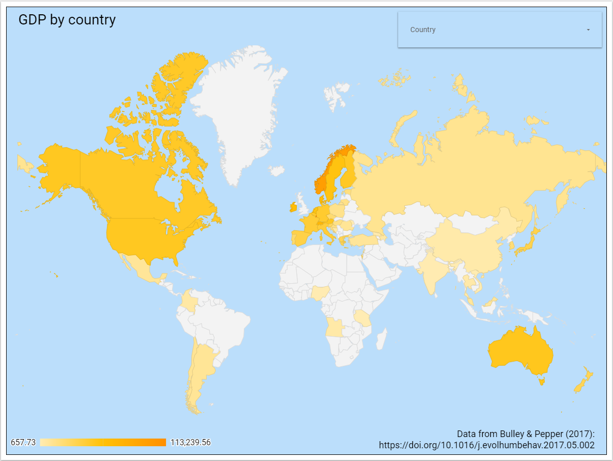
In the process of our analysis, we found that bar charts comparing countries made little intuitive sense. So, we mapped the data instead. These maps of life expectancy, intertemporal choice, and ages at first birth are available online, as a supplement to the paper. The raw data can be found as a supplement to our paper [link here].

(click on the image for an interactive map.)
(click on the image for an interactive map.)
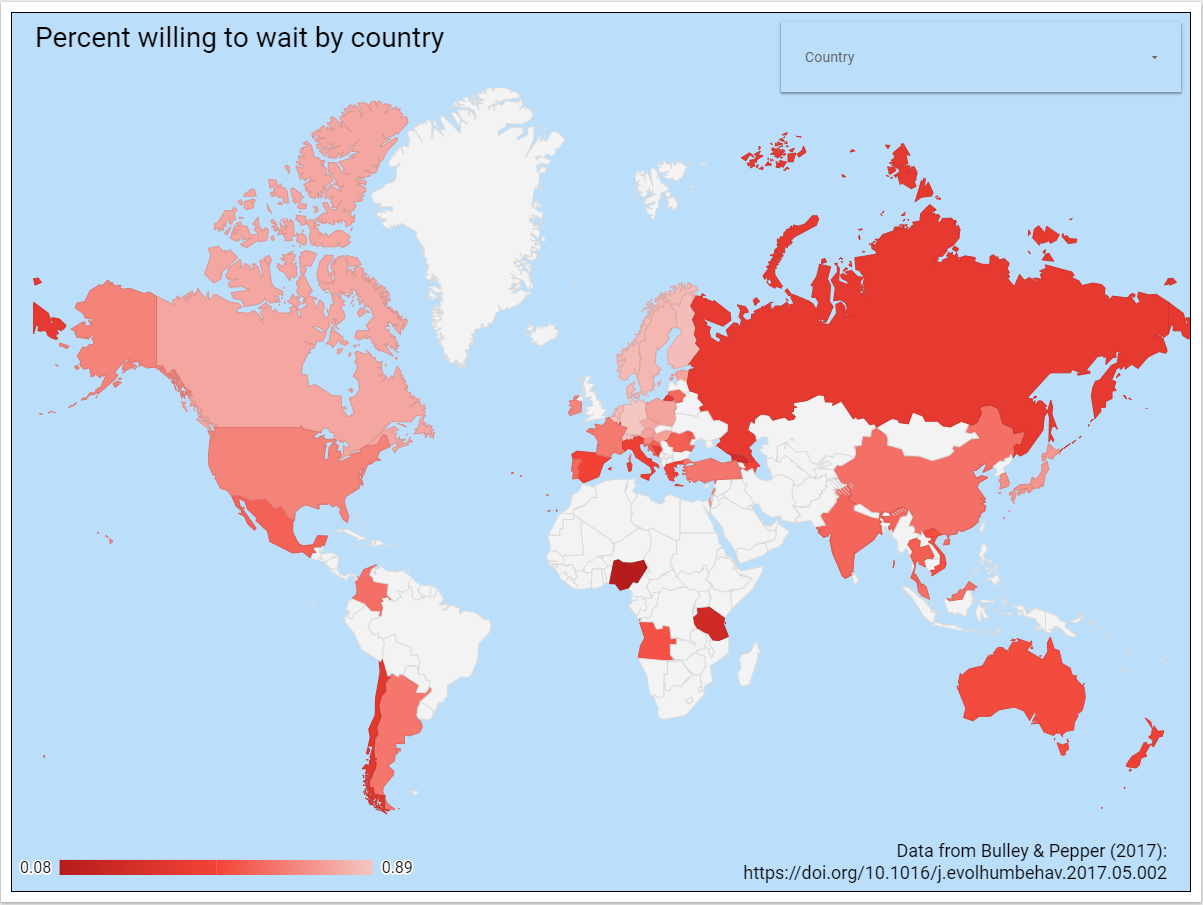
Measured by percentage of respondents willing to wait for a later-larger reward
(Click on the image for an interactive map.)
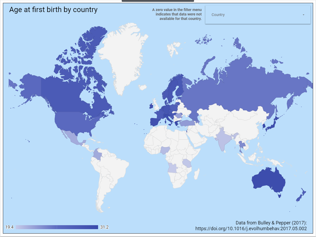
(Click on the image for an interactive map.)
